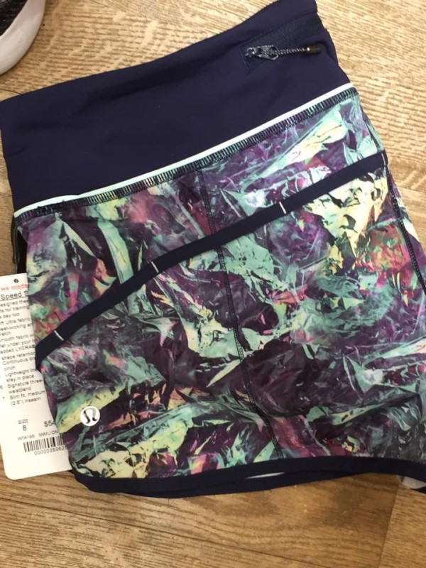
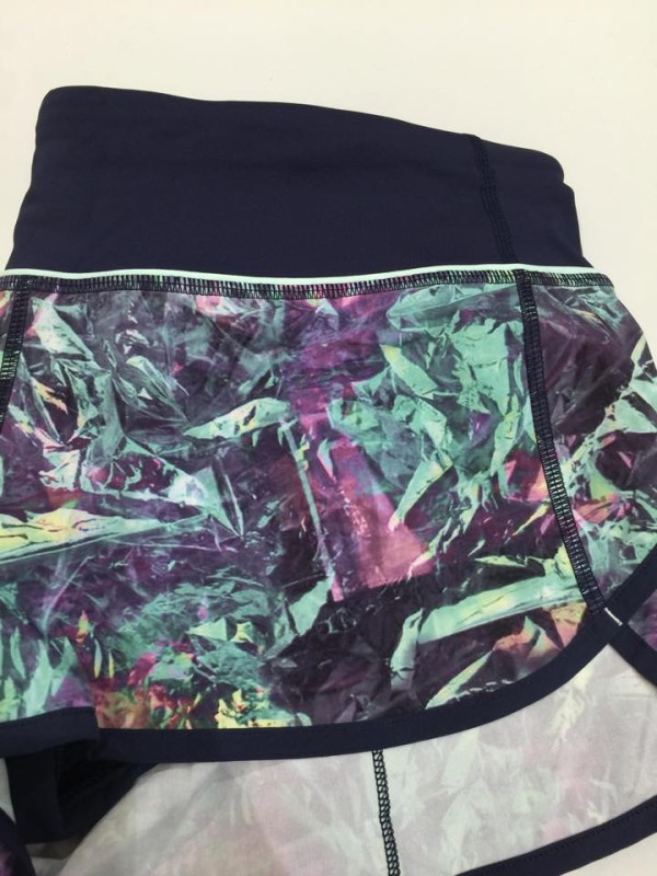
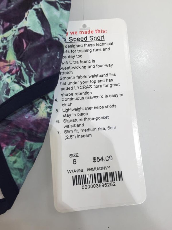
Iridescent multi is coming out in full force this April. Speed shorts are here, trimmed with deep navy. These are 4-way stretch, just like everything else these days. No word on fit yet. These were seen in a Canada store. I usually prefer simpler prints and solids, and I don’t love the color scheme, so I will be passing these up though I admit they are nice.
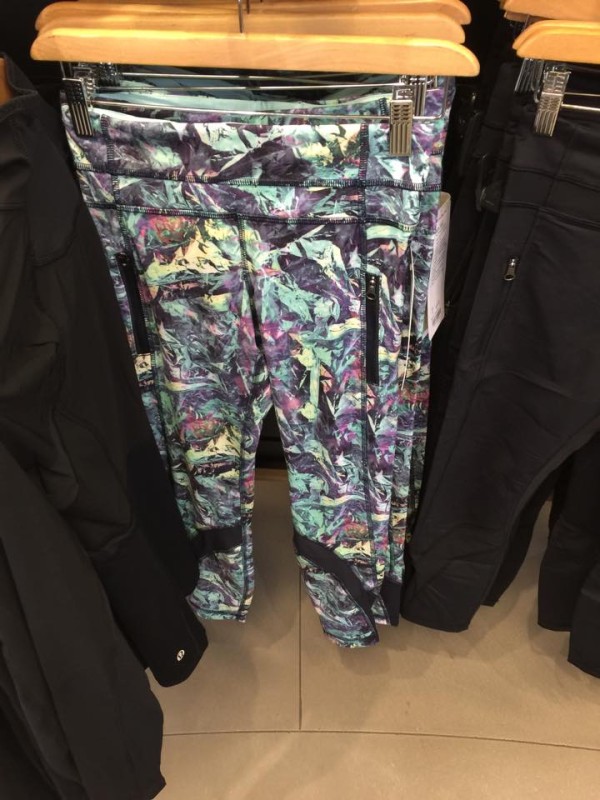
Also new in iridescent multi: inspire tights! These are a lot of print, but could be fun with simple solid tops. Again, seen in Canada.
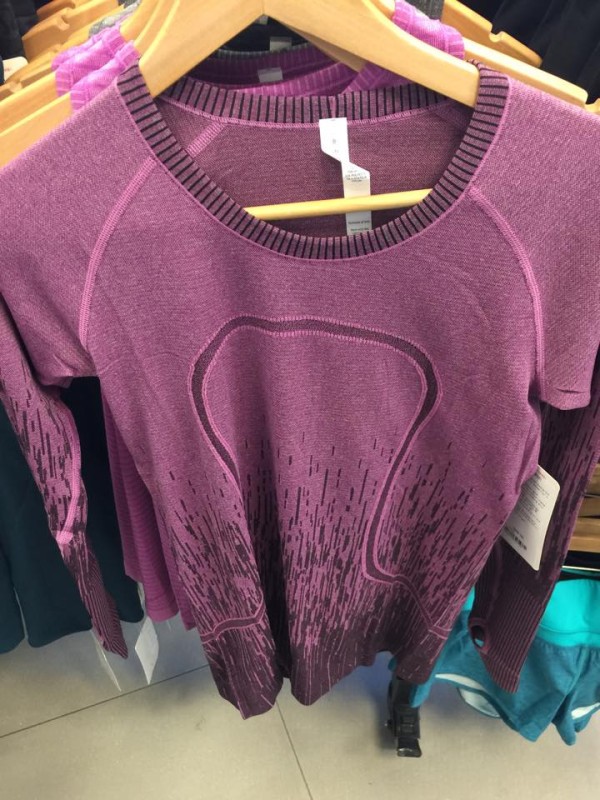
This regal plum patterned swiftly was also spotted.
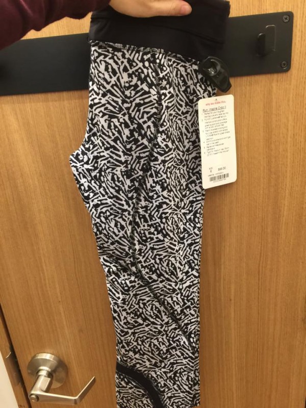
And brushed animal inspire crops (seen in Aus last week) have arrived in Canada, too.
[Thanks to Agent R for these pics!]



That iridescent multi just looks like a bad 80’s trip. Maybe that’s showing my age but I can’t help but think it looks so unbelievably dated. I’m glad lulu is trying something other than stripes and florals but this just doesn’t do it for me.
Haha! I can definitely see why you’d say that. Several of their prints and designs have been leaning toward 80s/90s-inspired lately. I do agree that I’m glad they’re getting away from the same motifs every season though, so I appreciate the effort even if I’m not sold on the individual pieces.
It’s like my reaction to the blushed illusion top speed crops – I like this idea in the abstract, but would I actually wear it in real life? Heck no. I can’t seem to win lately with lulu’s colors/prints. Either their stuff is way too flashy for me or way too dull.
I agree. A lot of the printed stuff is tacky, especially when mixed with too many textures, colors, and other prints. That’s why I loved the sleekness of Alala when AA introduced it on her blog and have bought several pieces of Alala since then–only a few of lulu this year. My favorites from this year have no pattern at all but a nice cut/fit/useful detail.
I agree with you on this print but I think on something as small as speeds the abstract print is a fun print to wear running a race or training in the summer. I think in wuc/inspires I wouldn’t wear it in real life either but on speeds I definitely would since it’s a smaller item and not so much print all over in a big area. I do like it in the speeds. I don’t on anything else.
I’m kind of in the same boat. A lot of the designs of late are overstyled/gaudy or just straight-up boring.
I’m digging the new print, and I love the inspire tights in a major way, but I think this is too much print for me. The speeds are nice, but I already have colorful paradise grid, and I think these are too similar imo.
Yeah, it’s a LOT of print. I think the paradise grid and iridescent are pretty different color schemes, but you’re talking to the lady who has a lot of speeds, so I’m probably not the best one to ask. :)
Brushed animal kind of reminds me of last year’s pretty palm print. I hope the regal plum swiftly comes in a S/S. There are no SS swiftlies left online other than black.
Yeah, it’s in the same neighborhood as pretty palm, definitely, but I do like the somewhat more abstract look of brushed animal. There’s already a regal plum swiftly SS in Aus, but it’s a solid, not patterned: http://images.lululemon.com.au/is/image/lululemon/LW3F15S_017380_1?$pdp_main$