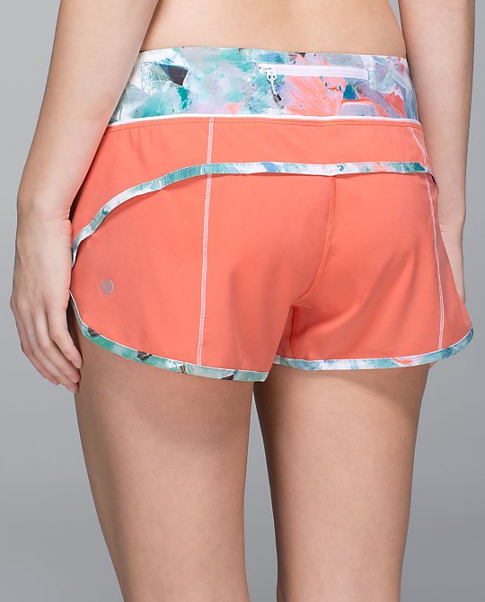
New plum peach speed shorts with blushed illusion trim.
BTW–the store that told me the color code on the first appearance of this pattern (the inspire crops) said it was brushed illusion, but it turns out it’s actually blushed illusion. Sorry about that! I’m correcting all my previous posts.
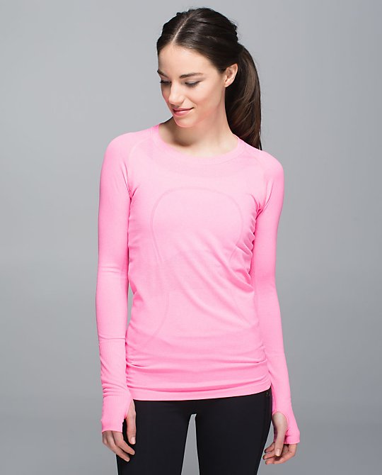
Neon pink is back in a swiftly long sleeve. There was a swiftly racerback and short sleeve that came out over the summer, but this color looks waaaay different–lighter, much more of a true pink, and less orange tones. (Here’s a pic of the first neon pink to compare.)
More swiftlies! These were all in the pic from an Aussie store this weekend: new space dye harbor blue and plum peach. There’s also a plum peach SS.
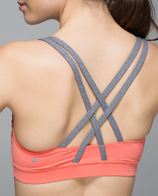
Speaking of those Aussie pics, there was this new bra in the picture as well. It’s plum peach/heathered slate.
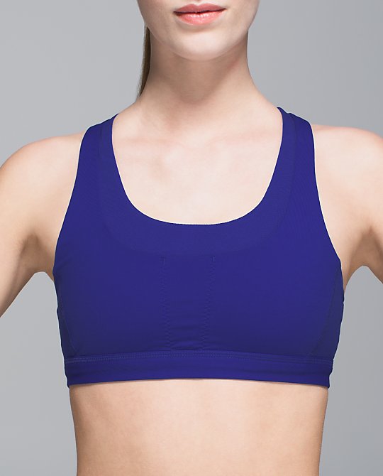
The stuff your bras also uploaded. This is a nice pic of the true shade of harbor blue. Love!
The new blushed illusion inspire crops uploaded as well as the run times shorts.

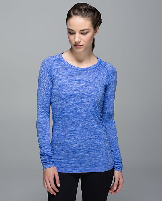
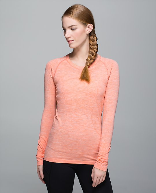
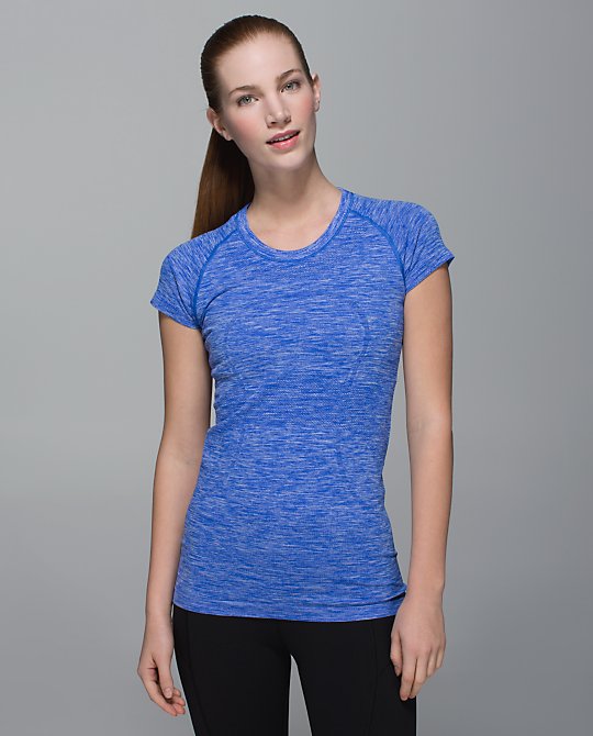
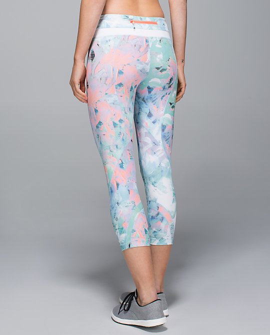


Oh wow loving harbor blue! Kind of similar to pigment except looks a little more true blue than pigment tends almost to look purple. Hoping we see a crb since we never saw a pigment one! Also still loving those inspires… I’m wondering if they will have to be cherry picked for placement?
Yes, I agree about harbor being more of a true blue than pigment. It might be quite similar to sprinkler blue or wish blue from a loooong time ago. I would die over a harbor CRB! I bet you would want to cherry pick the inspires, at least a little. In the stock photo the two legs look pretty mismatched.
those speeds are terrible imo. also that blushed illusion print reminds me of a couch or wallpaper from a mid 90s beach house. hope it gets better!
I hate plum peach, and the blushed illusion is just the icing on the cake. Ick.
I agree with h|c – a lot of people seem excited about blushed illusion, but I think it looks dated and tacky.
I think it would’ve been much better if the color scheme wasn’t so muted. Definitely 90s beach house wallpaper, that was spot on.